If your home town is still facing weeks of bitter cold, maybe you need a boost of cheery color even more than I do! And for those of you in the southern hemisphere. . . Well, any time's a good time for a springtime palette. (g)
Ten on Tuesday: Ten (or so) Springtime Palettes
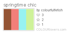
1. springtime chic--
I'm mainly drawn to the apple green and aqua/robin's egg blue combo (I have a real thing for those colors, it seems), but I think the addition of the coral pink and warm brown is nice, too. This combo is cheerful and gives a nod to classic springtime pastels, but it's not "plastic Easter egg"-y, if you know what I mean. (g)
2. Lady Beetle's House--
Here's something a bit brighter. Those greens paired with peach and berry hues look sweet to me. I can almost taste fruit-flavored candy!

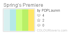
3. Spring's Premiere--
This palette looks like a sunny day to me. I love how simple and fresh it is. It reminds me of clean laundry flapping on the line-- little lambs frolicking on the lawn-- little puffy clouds drifting lazily across a baby blue sky. . . Well, you get the idea. ;o)
4. Spring Forth--
This one starts from a similar place as the last one-- the classic combination of yellow, green, and blue-- but it progresses into darker shades of blue. For me, the darker blues take the palette from the sunny afternoon through the twilight and into moonrise (with a liberal sprinkling of stars and a soundtrack of frog song ;o)). Maybe to someone else they're a reminder that there can still be a chill in the air in early spring. . .
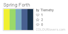
Now that I look at this again, I'm getting some Starry Night (Van Gogh) vibes. Maybe not quite greenish enough in the blues, though. . .
5. spring1--
More yellow, green, and blue. I must not be the only one who loves these colors together. ;o) These are all pretty warm, I think, which is fitting for spring, I guess.

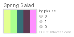
6. Spring Salad
These colors do remind me of a salad with lots of lovely, colorful lettuces. Taken on their own, some of these colors (the dark teal and especially the plum) may not seem particularly springlike, but who says you can't have dark colors in a springtime palette? Spring doesn't have to be all pastels (unless you like it that way, of course). A little variety can spice things up.
7. springforward and spring spirits--
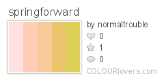
This palette is proof that you should "never say never" about a color. As fashion trends shift-- and as our perceptions shift with it-- we sometimes find ourselves liking colors we once thought we hated. If you had told "Teen Me" that I'd someday like "harvest gold" and tints of mustard, I probably would've laughed at you. ;o) While they still aren't my favorite colors in the world, I have to admit that they have a definite appeal in certain applications. For example, this gentle progression from softest pink to champagne and gold warms me right up.
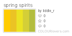
For a golden palette that's less delicate, how about this one?
8. spring velvet and spring--
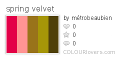
I'm a sucker for combinations of dark red and light green or pink and green. With these rather bronzey greens, the combo isn't at all childish or "1950s ice cream parlor-ish" (not that I don't like that style, too!). Instead, it has a certain maturity. Or maybe I'm just won over by the word "velvet". ;o)
Ok, I can't leave it at just one, so here's another "red and green" combo:
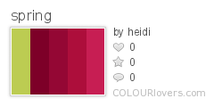
(sighs) Ah, the perfect "complimentariness" of the spring green with the wine reds. . . Anyone else ever read The Blue Castle by L.M. Montgomery? I've always coveted Valancy's dress. . .
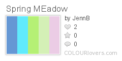
9. Spring Meadow and spring--
Here's something a bit more "rainbowy". I'm very fond of the softness of these colors in contrast with the medium periwinkle blue. . .
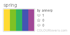
But if you like something a little bit bolder, try this one:
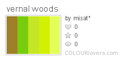
10. vernal woods--
Let's close with something that puts most of the focus on green, the most abundant color of springtime. The ColourLovers site overflows with lovely palettes that demonstrate a very gradual shift in color. These generally appeal to me, but today, I was drawn to this palette with a little more variety.
Also on the subject of springtime color--
If you'd like to see what you're supposed to like this season ;o) have a peek at a couple of color forecasts for spring-summer 2008: Fire Mountain Gems and Pantone Fashion Color Report.
No comments:
Post a Comment