Whether you think of Valentine's Day as a 24-hour love fest-- a good excuse to eat lots of chocolate-- a commercial nightmare dressed in pink and red-- or a painful "rub it in my face, whatdoncha" taunting of single folks everywhere ;o)-- there's a color scheme for you! (g)
Note: I find that the color palettes are much more powerful when viewed larger and against the darker background of the original site. To get a better feel for the colors, click the palettes to open up new windows.
Ten on Tuesday: Ten (or so) Valentine-Themed Color Schemes
1. Hardcore Valentine. Reds tending toward black, with a nice watermelon-y punch in the mix.

For a similar (red-themed, going from dark to light) palette, take a look at MBV Loveless. Again, we start with an almost black shade of red, but this time we lighten toward magenta for a very different look.

2. Still My Valentine. Here, we turn the whole focus on those delicious watermelon and salmon pinks. Sweet and warm, but more mature and restrained than you'd expect from a palette so dominated by pink.

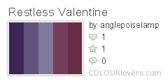
3. Restless Valentine. Purples and dark mauves are cooler (in tone) than the traditional reds and pinks.

4. Valentine Kiss. Spicy orange-reds, sophisticated pink, and rich scarlets.

5. My Secret Valentine. A different take on Valentine pink. I'm fond of the way this muted pink fades into a soft, minty green.

6. Atomic Bombshell. Youthful, fresh, and full of energy! This combination of pinks and purples-- with a dash of bold red-- screams "teenage girl" to me, but I don't think you have to be a teen to appreciate this palette.

If you like the excitement of Atomic Bombshell, but prefer to leave purple out of the equation, why not try Heart Beat. Lots of steamy hot pink grounded by a maroon that's flirting with pitch black.

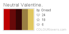
7. Neutral Valentine. Dark, velvety reds accented by understated golds. They combine to make a palette that is understated, mature, and elegant.

8. Chocolate Valentine. This palette uses pink very sparingly, instead putting the emphasis on sweet-toothed creams and browns. The single rosy accent is all that's needed to define this as a Valentine color scheme.

9. Nostalgia Valentine. Muted colors, with a couple of pastels. There's more grey and blue in this palette than you'd usually find in Valentine-themed color schemes, which gives it that slightly sad feeling you'd expect from something described as "nostalgic". ;o)

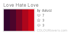
10. Love Hate Love. Ranging from dark, plummy purple to red-hot red, this color scheme can go either way-- passionate love or hatred. ;o) Personally, I love it.

Didn't see one here to suit your personal tastes? Why not go over and run a search of your own? Or better yet, make up some of your own! :o)
1 comment:
These are some really great color ideas! Just what I needed to get my brain going!
Post a Comment